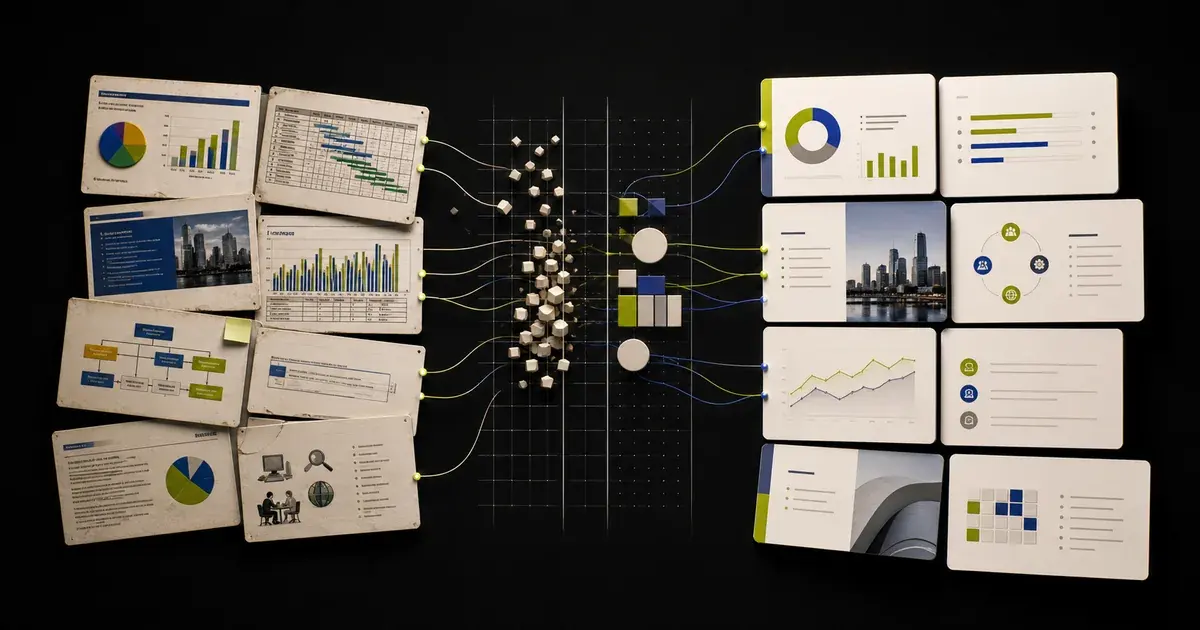
A reliable way to redesign an existing PowerPoint with AI is to separate the job into three decisions: what the deck must say, what visual system should express it, and what the final PPTX must preserve. Audit the presentation before changing it, approve a small set of representative slides, then apply the accepted rules across the rest of the deck. A successful redesign is not a filter applied to every slide; it is a controlled rebuild of hierarchy, layout, and consistency around a specific audience and outcome.
If you need the broader import-and-edit process first, read how to edit an existing PowerPoint with AI. The workflow below assumes that a real deck already exists and that its content, design, or both need a substantial upgrade.
Define what “redesign” means for this deck
Redesign can describe very different scopes. Choose one before you prompt an AI tool.
| Scope | What changes | What normally stays |
|---|---|---|
| Content polish | Titles, wording, density, emphasis | Layout system, brand, slide order |
| Visual refresh | Typography, color, spacing, imagery, chart treatment | Core story and factual content |
| Structural redesign | Narrative order, slide purpose, content grouping | Source facts, required sections, delivery format |
| Template migration | Masters, layouts, theme, repeated components | Approved content and selected assets |
| Audience adaptation | Emphasis, examples, terminology, call to action | Verified facts and overall brand |
Most troubled decks need a combination, but that does not mean the AI should change everything at once. The more dimensions you change in one pass, the harder it becomes to identify where a factual error, formatting regression, or weak design decision entered the file.
Write a one-sentence redesign brief:
Redesign this [DECK TYPE] for [AUDIENCE] so they can [DECISION OR ACTION], while preserving [FACTS, BRAND ELEMENTS, REQUIRED SLIDES, AND DELIVERY CONSTRAINTS].For example:
Redesign this quarterly business review for regional sales leaders so they can identify the three accounts that need intervention, while preserving every reported value, source note, customer name, approved brand element, and the editable PPTX format.This is more useful than “make it modern” because it defines what the redesign must accomplish.
Audit the deck before designing it
Do not begin by choosing colors or generating images. First determine what each slide is doing and whether it deserves to exist.
Create a slide inventory
For every slide, record:
- slide number and current title;
- intended job: orient, explain, prove, compare, decide, or act;
- primary audience question it answers;
- source of its facts;
- whether the content is current;
- whether it duplicates another slide;
- the visual form: text, process, timeline, chart, table, image, or mixed;
- redesign priority: keep, revise, combine, split, move, or remove;
- risk: low, medium, or high.
High-risk slides include legal language, financial data, detailed charts, regulated claims, complex diagrams, and slides with important notes or animation sequences.
Separate story problems from design problems
A slide can look old because its story is unclear, not because its colors are wrong. Diagnose the problem before prescribing a visual solution.
Story problems include:
- the title names a topic instead of making a point;
- evidence appears before the audience knows the question;
- several slides repeat the same idea;
- the recommendation is buried;
- the deck ends without a decision or next step;
- claims are disconnected from their sources.
Design problems include:
- weak contrast between title, evidence, and supporting detail;
- too many competing focal points;
- inconsistent margins or alignment;
- unstructured paragraphs;
- chart decoration that obscures the comparison;
- multiple visual systems within one deck;
- text that is too small for the delivery setting.
Fix the story first when the problem is structural. A beautiful sequence of unclear slides is still an unclear presentation.
Protect the source before changing the system
Keep an unchanged original, make a working copy, and produce a visual baseline. If your redesign must retain the original theme or complex behaviors, use the more detailed PowerPoint formatting preservation checklist.
Create a source ledger for claims that matter:
| Claim or value | Source | Source date | Allowed transformation |
|---|---|---|---|
| Revenue total | Finance workbook, cell reference | 2026-07-10 | Reformat only; do not recalculate |
| Customer quote | Approved case-study transcript | 2026-06-22 | Shorten with ellipsis only if meaning remains |
| Market estimate | Named report and page | 2026-04-01 | Keep scope, unit, year, and caveat together |
| Roadmap date | Product plan | 2026-07-12 | Do not change without owner approval |
Tell the AI to flag unsupported claims instead of filling gaps. A redesign should improve comprehension, not convert uncertainty into confidence.
Build the visual system before redesigning every slide
PowerPoint's system is built around themes, slide masters, layouts, placeholders, and slide-level objects. Microsoft explains that a theme includes coordinated colors, fonts, and effects, while the slide master and related layouts govern repeated structure. See What is a slide master in PowerPoint? and Apply a slide layout.
Treat these as design decisions, not implementation details.
Define a compact design system
Before scaling the redesign, specify:
- Slide size: normally inherited from the existing delivery requirement.
- Theme colors: primary, accent, neutral, background, positive, warning, and negative.
- Typography: title, section, body, label, annotation, and data-display roles.
- Spacing: page margins, column gaps, object spacing, and vertical rhythm.
- Shape language: corner radius, line weight, fill behavior, and shadow policy.
- Image direction: photographic or illustrative style, crop behavior, and treatment.
- Data style: chart palette, gridlines, labels, units, and source-note format.
- Repeated elements: logo, slide number, footer, confidentiality label, and citations.
- Motion policy: which transitions or animations are permitted and why.
Limit the number of rules. Consistency comes from reusing a clear system, not from making every slide look identical.
Design representative slide archetypes
Do not approve a redesign based only on the title slide. Select a test set that represents the real difficulty of the deck:
- title slide;
- section divider;
- message-and-evidence slide;
- two-column comparison;
- process or timeline;
- chart slide;
- table or dense detail slide;
- image-led slide;
- recommendation or decision slide;
- closing slide.
If the system works across these archetypes, it is more likely to scale. If it works only on low-density slides, revise the system before applying it to the full deck.
Choose a theme migration strategy deliberately
PowerPoint offers different behaviors when content moves between presentations. Microsoft's Reuse Slides instructions explain that an inserted slide can inherit the destination design or retain the source formatting. Microsoft's guide to applying a template to an existing presentation recommends starting from a fresh file based on the template and importing the existing slides with the destination theme.
Those options represent two different goals:
- Keep source formatting when preserving the original visual identity matters more than standardizing the destination.
- Use destination theme when migrating content into a new approved system is the purpose of the redesign.
For an AI-assisted redesign, make the same choice explicit. Do not ask the AI to “keep the current formatting” and “apply a completely new template” in the same instruction. Instead, specify which source properties survive and which destination rules take precedence.
Redesign in a controlled sequence
Step 1: approve the narrative outline
Write one sentence for each slide. The sentence should state the message the audience should retain, not merely the topic.
Weak outline item:
Market overviewStronger outline item:
Mid-market demand is growing, but our current pipeline is concentrated in two regions.Check the sequence without looking at the slide designs. Does each statement create a reason to see the next one? Is the recommendation supported before it appears? Can a decision-maker understand the deck from the titles alone?
Step 2: rewrite titles as conclusions
Use short, evidence-backed titles when the slide makes a claim. Retain neutral labels for true navigation slides, appendices, and agenda items.
Avoid overstating the evidence. If the data shows correlation, do not write a causal title. If the sample covers one market, do not generalize it globally.
Step 3: reduce content before shrinking text
When content does not fit, use this order:
- remove duplication;
- shorten labels and sentences;
- move supporting detail to notes or an appendix when appropriate;
- split slides that contain two different messages;
- choose a layout suited to the content;
- change font size only after those options are exhausted.
Small text is often a symptom of unresolved prioritization. It is rarely the best first fix.
Step 4: redesign one archetype at a time
Start with one representative slide. Give the AI a specific brief:
Redesign slide [SLIDE NUMBER] as the approved reference for [SLIDE ARCHETYPE].

Audience: [AUDIENCE]
Slide message: [ONE-SENTENCE TAKEAWAY]
Source of truth: [SOURCE]
Visual system: [THEME COLORS, TYPE ROLES, MARGINS, GRID, SHAPE AND IMAGE RULES]

Preserve exactly:
- every verified number, date, proper noun, qualifier, and citation;
- slide dimensions, required logo, footer, and slide number;
- editable text, chart, table, and image elements where supported.

Improve:
- visual hierarchy;
- reading order;
- alignment and spacing;
- the prominence of the main evidence.

Do not add decorative data, invent an image caption, or introduce a claim that is not in the source. Return a short rationale and list any manual checks required.
Variables are [SLIDE NUMBER], [SLIDE ARCHETYPE], [AUDIENCE], [ONE-SENTENCE TAKEAWAY], [SOURCE], and [THEME COLORS, TYPE ROLES, MARGINS, GRID, SHAPE AND IMAGE RULES]. The checkpoint is whether the new slide communicates the approved takeaway faster while preserving every source fact and required brand element.
For narrower prompts covering titles, charts, tables, density, and audience adaptation, use the AI prompt library for editing PowerPoint.
Step 5: turn the accepted slide into a reusable rule
After approving the reference, document why it works:
- title begins at a fixed x-position;
- supporting label uses the secondary text role;
- main evidence occupies the larger column;
- sources sit in a consistent footer zone;
- charts use one highlight color and neutral context series;
- related objects use equal gaps;
- decorative elements never compete with data.
Apply those rules to slides with the same job. Do not copy a layout onto content that has a different communication need.
Step 6: align and distribute objects systematically
PowerPoint provides alignment relative to selected objects or the slide, along with grids and Smart Guides. Microsoft's Align or arrange objects explains these controls. Use them in the final PowerPoint check even if the AI preview appears aligned.
Look for near-misses: objects that differ by a few pixels, uneven spacing, inconsistent title baselines, and labels that appear centered but are aligned to boxes of different sizes.
Step 7: perform an accessibility pass
A redesign can improve visual clarity while accidentally damaging screen-reader order. Microsoft recommends unique slide titles, meaningful alt text, sufficient contrast, and logical object order. Use the official PowerPoint accessibility guidance and run Review > Check Accessibility.
At minimum, verify:
- every content slide has a useful title;
- contrast is adequate for the actual display environment;
- meaning is not conveyed only through color;
- informative images and diagrams have accurate alt text;
- decorative objects are marked decorative where appropriate;
- links make sense outside surrounding prose;
- the reading order matches the visual reading path.
Use a redesign scorecard instead of “looks better”
Review every archetype against the same criteria:
| Criterion | Review question | Pass condition |
|---|---|---|
| Purpose | Can a reviewer state why this slide exists? | One clear job and takeaway |
| Accuracy | Did any fact, qualifier, or relationship change? | Every claim matches its source |
| Hierarchy | Is the first focal point the intended message? | Title and evidence dominate supporting detail |
| Density | Can the slide be understood in the delivery setting? | No essential text is unreadably small or crowded |
| Consistency | Does it follow the approved visual system? | Roles, margins, colors, and components are reused |
| Evidence | Can the audience see why the takeaway is credible? | Source, labels, units, and caveats remain connected |
| Accessibility | Can people navigate and interpret it beyond color alone? | Accessibility review passes |
| Editability | Can expected elements still be revised in PowerPoint? | Required text and data objects remain usable |
Use comments for failures. “Title wraps to three lines at 100% zoom” is actionable. “Doesn't feel premium” is not.
Common AI redesign mistakes
Making every slide a hero slide
Large type, sparse content, and dramatic imagery can work for an opening. Applying the same treatment to a financial appendix or implementation plan destroys information density without improving understanding.
Replacing evidence with decoration
A generic illustration should not displace the chart, quote, product view, or process detail that proves the point. Ask what the image contributes. Remove it if the answer is only “visual interest.”
Inventing consistency instead of finding it
If the source deck has multiple masters or conflicting styles, the AI may choose one arbitrarily. Decide the authoritative system first.
Changing too much at once
When copy, layout, color, imagery, chart form, and slide order all change together, review becomes slow and errors become difficult to trace. Work in explicit passes.
Treating AI output as source material
AI-generated text is a draft, not evidence. Require a source for facts, statistics, quotations, customer claims, dates, and competitor comparisons. If the source is not available, label the statement for verification rather than presenting it as final.
Flattening the deliverable
A beautiful image of a slide may be enough for a social post, but it is not an editable business presentation. Confirm the required PowerPoint objects remain usable and that the exported .pptx survives a reopen-and-edit test.
Where an AI editor fits
An AI presentation generator is optimized for creating a new deck. An AI PowerPoint editor is more relevant when the existing file itself is the starting point. If you are choosing between those workflows, compare them in AI PowerPoint editor vs. AI presentation generator.
Yrkie supports two paths: create a new presentation from a prompt and source material, or import an existing PPTX into the Copyist workflow. For a redesign, the second path lets the current deck remain the working material. Supported text, images, charts, tables, formulas, icons, and layout elements can remain editable in the canvas, and selected elements can be refined without requiring the entire deck to be regenerated.
That workflow still needs judgment. Some PowerPoint features require manual verification, source facts need owner review, and no serious redesign should promise complete fidelity or eliminate manual review. The advantage is a more controlled starting point: improve the presentation you already have, approve changes at the element and slide level, and return to a PowerPoint delivery workflow. Start with your existing presentation in Yrkie.
Final redesign checklist
Before delivery, confirm:
- The original file is archived and unchanged.
- The redesign brief names the audience, decision, and preservation constraints.
- Every slide has one defined job.
- The title sequence tells a coherent story.
- Every factual change is traceable to an approved source.
- The master, layouts, theme, and repeated components form one usable system.
- Representative slide archetypes were approved before the design was scaled.
- Text is readable in the actual presentation setting.
- Charts, tables, labels, units, and citations are accurate.
- Alignment, spacing, crops, and object layers were checked in PowerPoint.
- The Accessibility Checker and reading-order review were completed.
- The exported PPTX opens, edits, saves, reopens, and presents as expected.
A redesign is complete when the deck communicates more clearly, remains faithful to its sources, and works as an editable presentation—not simply when every slide looks different from the original.